YouTube Focus Mode
Minimizing distraction and promoting concentration for students using YouTube for education.
Project Type: UIUX, User Research
Team: Individual
Duration: Dec - Jan 2021

The Problem
YouTube is great for entertainment, but not for productive activities like education and work
Over a decade, YouTube has evolved from a small video-sharing platform to the second-most visited site in the world in 2020. As YouTube becomes increasingly relevant in the lives of students, we find ourselves not only using the platform for entertainment but also for education and work.
However, the current platform, including its homepage and “related video” recommendations, are not designed with users’ productivity needs in mind. YouTube’s current homepage consists of an end-less list of recommended videos that often includes internet viral trends and other popular content identified by the platform’s algorithm.
What students use YouTube for
To better understand how students use YouTube for productivity purposes, I conducted interviews with 3 college students over Zoom.
I found that the top 4 reasons for using YouTube for academic reasons are the following:
Watching lecture videos (42.8%)
Playing study music (22.5%)
Finding explanations for confusing concepts (21.3%)
Academic research (13.4%)
Despite frequently using YouTube for academic reasons, participants expressed that they found the current design of the platform to be distracting. A participants shared an anecdote that illustrates this problem:
“I was supposed spend 15 minutes on YouTube to watch a video for my philosophy final, but that ended up turning into a three-hours binge of America’s Got Talent”
Points of distraction in the current interface
Breaking down the current interface, I identified 3 main points for distractions in the current interface that draws the attention of students away from their intended purpose.

User Persona
To delve deeper into the interaction between the user and the platform, I constructed a fictional persona to see the problem from her perspective and identify common user needs and frustrations.

How Might We
After researching user behavior, analyzing the current interface and understanding user needs and frustrations, I had a better grasp of what I want to achieve with my design.
Formulating it into a How Might We statement:
HMW make people feel motivated, focused, and conscious of time while using YouTube for productivity purposes?
Incorporating the points of distractions identification in the research phase, I broke down the overarching HMW into 3 more concrete, mini HMWs:
HMW re-imagine homepage to promote productivity and increase user control over content?
HMW prevent distractions from related videos
HMW foster awareness of time spent on the platform
HMW #1
HMW re-imagine homepage to promote productivity and increase user control over content?
I decided to replace recommended videos with productivity playlists (user-generated or frequently watched).


Minimal distractions
Encourage watch behavior
In the final iteration of the homepage, I kept my playlist approach but instead of displaying all productivity playlists on the homepage, I decided to significantly decrease the amount of content the user can see at once to reduce potential distractions.
The biggest video the user will see on the page is the video they have yet to finish watching from last time or the next video in the playlist the user last watched from. This is designed to acts as a reminder for the place the user last left off and as a direct elicitor of action (clicking the play button) to immediately engage the user, discouraging them to unproductively browse around the platform.
HMW #2
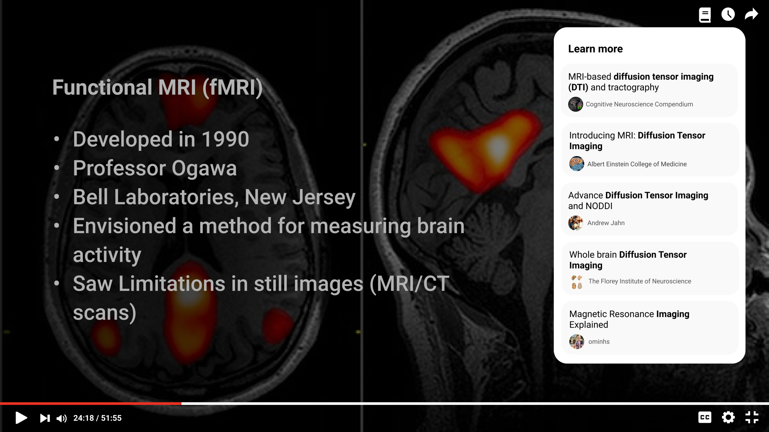
HMW prevent distractions from related videos next to the currently playing video?
I replaced related videos with “Learn More” a feature that suggests videos only upon request.

HMW #3
HMW foster awareness of time spent on the platform?
Solution: Timer feature + pop up reminder that informs user of time spent on the platform.

Reminder to take a break!
To make the user feel productive and conscious of their time while using YouTube, I decided to add a pop-up note that lets the user know when they have spent a long period of time on the platform and reminds them to take a break.
Reflection
If I were to do this project again, I would spend more time researching existing video platforms designed for productivity or education purposes like Skillshare. Looking at existing solutions and identifying their strengths and weaknesses would’ve helped inform my design choices for this project.
The biggest thing I learned from this project is that every detail in a design should be working towards the predetermined goal. For example, every component in the home screen redesign should be intentionally placed in a way to remote productivity and reduce distraction.