YouTube Focus Mode
Task
Redesign YouTube’s interface for education and productivity purposes
Type
Individual case study
Timeline
Nov 2020 - Dec 2020

The Problem
Despite the educational and informative content available on Youtube, the platform’s interface is not designed with users’ productivity needs in mind. Over a decade, YouTube has evolved from a small video-sharing platform to the second-most visited site in the world in 2020. As YouTube becomes increasingly relevant in the lives of students, we find ourselves not only using the platform for entertainment but also for work and education.
However, the current platform, including its homepage and “related video” recommendations, are not designed with users’ productivity needs in mind. YouTube’s current homepage consists of an end-less list of recommended videos that often includes internet viral trends and other popular content identified by the platform’s algorithm.
Research
I conducted interviews with 10 participants to find out common reasons of using Youtube for school.To better understand how students use YouTube for productivity purposes, I asked the interviewees to walk through a typical day for them during the semester, with an emphasis on the online platforms they interact with. I found that the top 4 reasons for using YouTube for academic reasons are the following:
Watching lecture videos
Playing study music
Finding explanations for confusing concepts
Academic research
Pain Points
Despite frequently using YouTube, participants have expressed recurring issues they have with the platform. I chose two main pain points and illustrated them using the two user personas below.


Goal Formulation
After identifying the pain points from the preliminary interviews, I was able to narrow down my project aim.
Make people feel motivated, focused, and conscious of time while using YouTube for productivity purposes.
Ideation
With a clear goal in mind, I started my ideation process by brainstorming solutions from 4 perspectives:
re-imagine homepage layout and content to promote productivity
prevent distractions from “related videos”
easy reference back to a specific timestamp
awareness of time spent on the platform

Through comparing the solutions, I picked out the ideas (denoted by a star on the lower right corner) that I thought would best address their respective issue.
Mid-Fi Prototyping
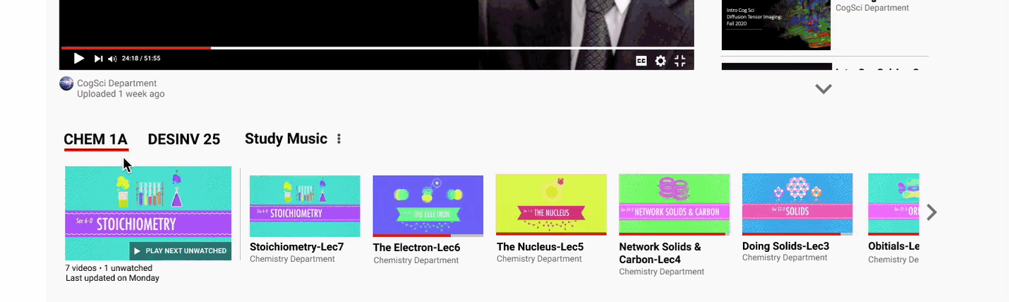
Homepage
Replacing recommended videos with productivity playlists to orient the user towards their productivity focus.
For students whose lectures are posted on YouTube in a playlist form, that playlist will be displayed on the homepage. Other user-generated or saved playlists for educational and productivity purposes like “study music” will also be directly accessible from the homepage. Since the homepage will be the first thing the user sees when navigating to YouTube, replacing recommended videos with productivity playlists orient the user towards their productivity focus.
Related Videos
Toggle “related videos” list to make exploring related content non-disruptive.The list of “related videos” on the right-hand side of a video could shift the user’s attention away from the video that is currently playing on the screen. However, these videos can be very useful to students who want to delve deeper into a topic by exploring related content. In search of a non-disruptive way to showcase “related videos”, I added a button that allows the user to toggle the list on and off.

Highlight
Easy reference back to timestampAdding a “highlight” for a key term or practice question at a specific time in a video allows the user to refer back to when they are studying for an exam. The user can categorize the “highlight” by adding a tag and jot down a few lines of notes.

All “highlights” will be saved to a newly-added “highlight” tab on the left navigation bar.

Hi-Fi Prototyping & User testing feedback
Homepage Ver.1
Enlarging unwatched videos in producitiviy playlists to make them standout.
Since a part of my goal for this project is to make the user feel motivated and productive, I wanted to draw attention to the videos in the playlist the user has yet to watch by enlarging them to make them stand out.
However, during user testing, participants were confused as to why certain videos are bigger than others since watched videos are typically denoted by lighter colors or watched tags instead of their sizes. I also later realized that it would be unreasonable to assume that people always watch videos in a playlist in order, making the placement of all unwatched videos at the top of the playlist unrealistic.
Homepage Ver. 2
Emphasize unfinished video to discourage unproductive browsing.
In my final iteration of the homepage, I kept my playlist approach but instead of displaying all productivity playlists on the homepage, I decided to significantly decrease the amount of content the user can see at once.
The biggest video the user will see on the page is the video they have yet to finish watching from last time or the next video in the playlist the user last watched from. This is designed to acts as a reminder for the place the user last left off and as a direct elicitor of action (clicking the play button) to immediately engage the user, discouraging them to unproductively browse around the platform.

To address the confusion about videos of different sizes that came up during the usability test, I made all videos in the playlist uniform in size. I also added a preview image that acts as the thumbnail of the playlist for easier identification.
Related Videos
Removed thumbnails of related videos to decrease chances of distraction and reduce cognitive load.
In addition to toggling the “related videos” list in my mid-fi prototype, I also decided to remove the thumbnails of the videos, leaving only the title and other text-based information. The rationale behind this is that thumbnails generally include information that is already in the title. With their bright colors and enlarged texts, they are effective attention grabbers, neither necessary nor desirable from a productivity standpoint.

Although I do recognize that most people prefer visual over text-based information, I think the resulting decrease in cognitive load and chance of distraction from the removal of thumbnails outweighs the costs.
Timer Pop-up
Foster feelings of productivity while using YouTube.
To make the user feel productive and conscious of their time while using YouTube, I decided to add a pop-up note that lets the user know when they have spent a long period of time on the platform and reminds them to take a break!


Create Highlight
Increase image size of Highlight for easy notetaking. For creating a “highlight”, I decided to enlarge the video image substantially from the mid-fi prototype since users might want to refer to the image when taking notes.
Highlights Page Ver.1
Requires too much scrolling for big collection of playlists.A direct translation from my mid-fi that is consistent with YouTube’s current design. But I later realize such a layout requires too much scrolling for a larger number of playlists.
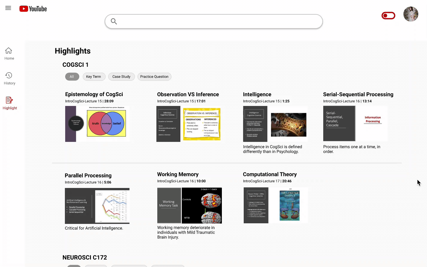
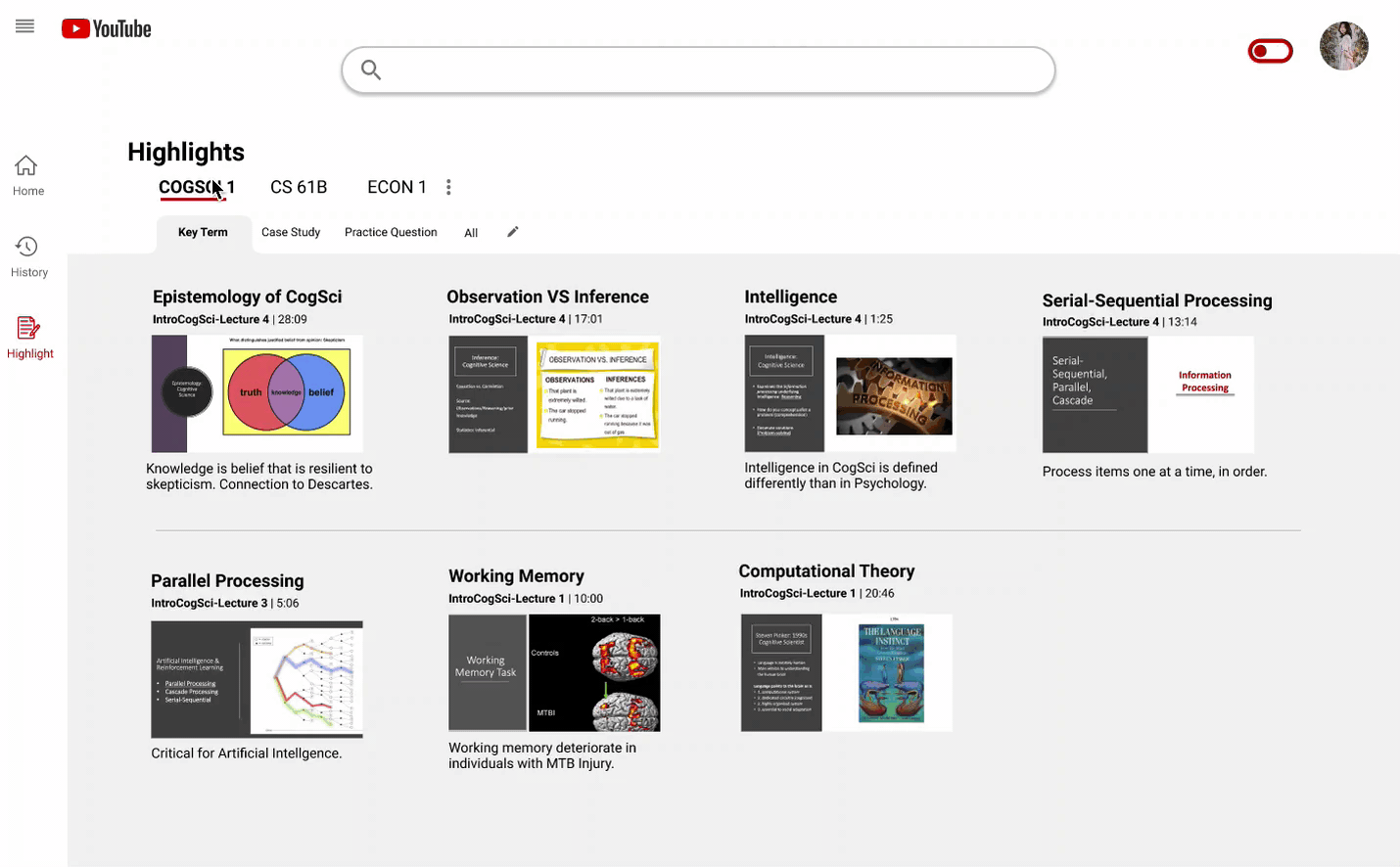
Highlight Page Ver.2
Using tabs to conserved space and search time.For the second iteration of the “highlights” page, I distributed the content among tabs to reduce the amount of scrolling required, which in turn conserved space and search time.
Additional Feature
Making Highlights accessible when watching the video.During a user testing session, one participant expressed that it would be convenient if existing Highlights are accessible when watching the video. I adopted this idea and incorporated it into my final design.
Reflection
If I were to do this project again, I would spend more time researching existing video platforms designed for productivity or education purposes like Skillshare. Looking at existing solutions and identifying their strengths and weaknesses would’ve helped inform my design choices for this project.
The biggest thing I learned from this project is that every detail in a design should be working towards the predetermined goal. For example, every component in the home screen redesign should be intentionally placed in a way to remote productivity and reduce distraction.
Prototype Demo