Room1000
Type: Pro-bono work for an on-campus architecture journal
Role: UI/UX, Web Design
Objective: Revamp the organization’s website to address usability problems and to include digital formats of journal articles
Back Story
Room1000 is a student-run architecture journal at Berkeley. In addition to designing how the articles in the issues will be displayed, which will be a new capability of the website, I was also tasked to redesign the landing page for specific issues (issue 6 and issue 8), the about page, as well as the mission statement.
Current Website
Room1000 currently has a simple website that contains an issues page. where all issue covers are displayed, a store, a donation page, an about page, and a mission statement.
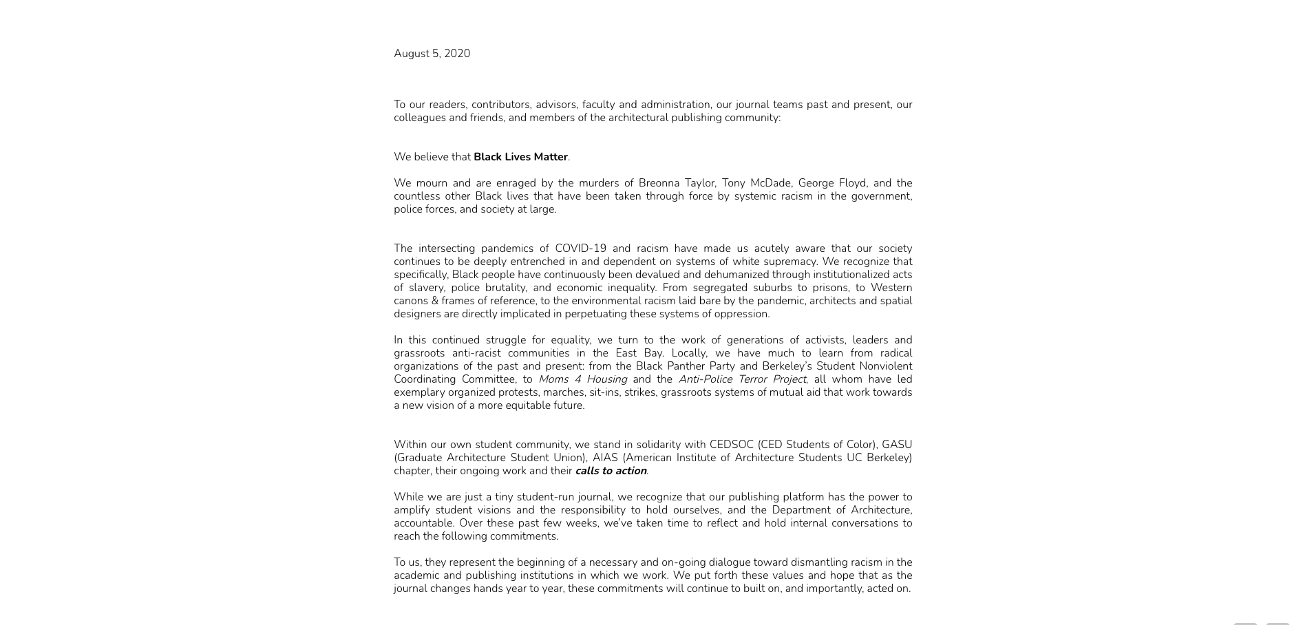
Website Issues
Room1000’s current website is fully functional but has several usability issues.
1. The font is too small and too lightweight, causing the text to be very hard to read.
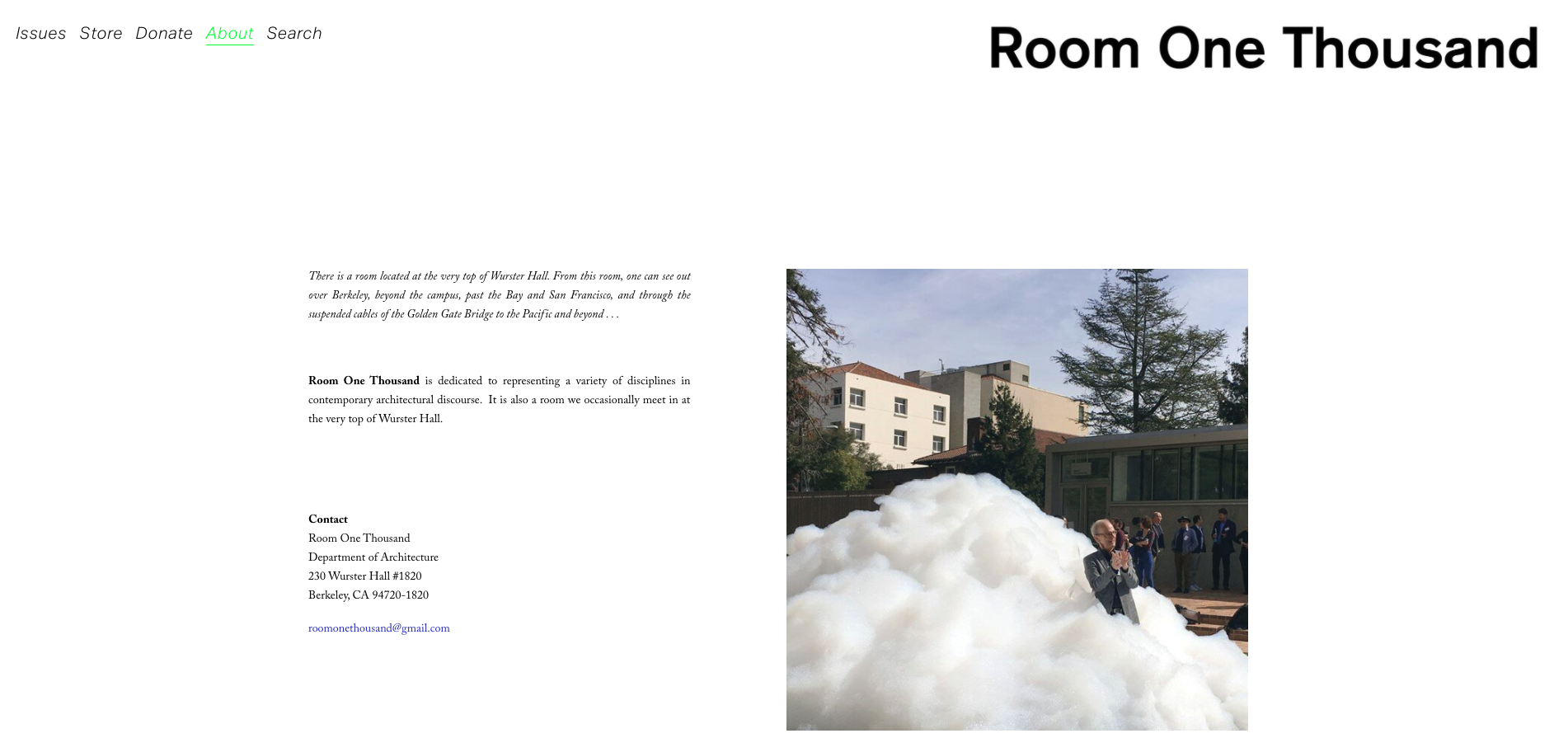
The “About” page
2. Text is cluttered and there is little visual hierarchy. Large paragraphs of text discourage readers from actually reading the information.
Mission Statement
3. Images placement and size are ineffective—readers gain very little information from them since they are small and blurry.
Issue 1005.999
Style
The redesign should be consistent in style with the current website and the published magazine issues.
Current site
Clean and minimalistic
Black-and-white dominated
Selected magazine issue pages
Spontaneous doodle elements
I made sure to incorporate these stylistic themes into the redesign.
Redesign
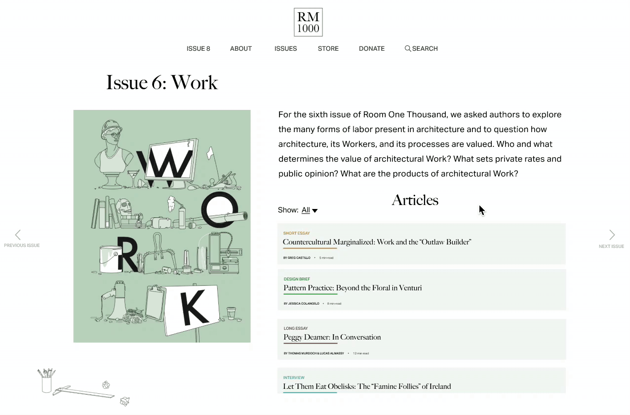
“Issue 6”
Current
The current layout feels very clustered and unbalanced with all text on the right half of the page and images on the left.
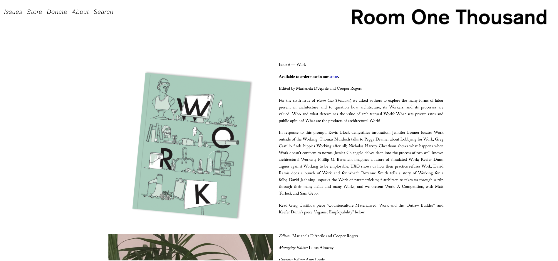
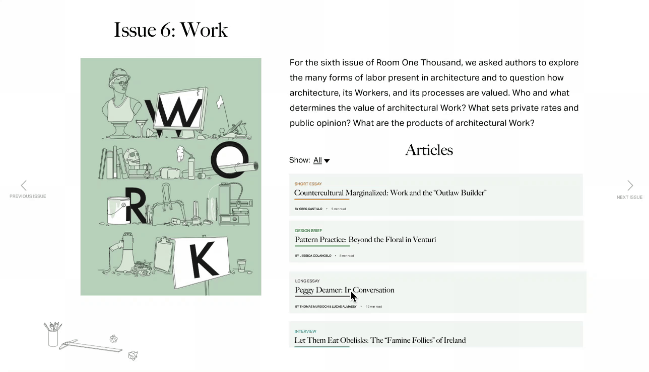
The current “issue 6” page
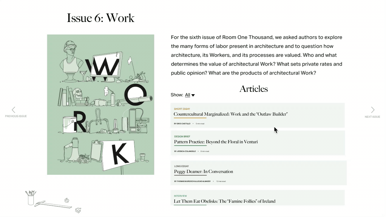
New
I added the articles section and cut down the amount of text to declutter the space. To balance out the weight of all the text on the right half of the page, I enlarged the issue title and added doodles to the left side.
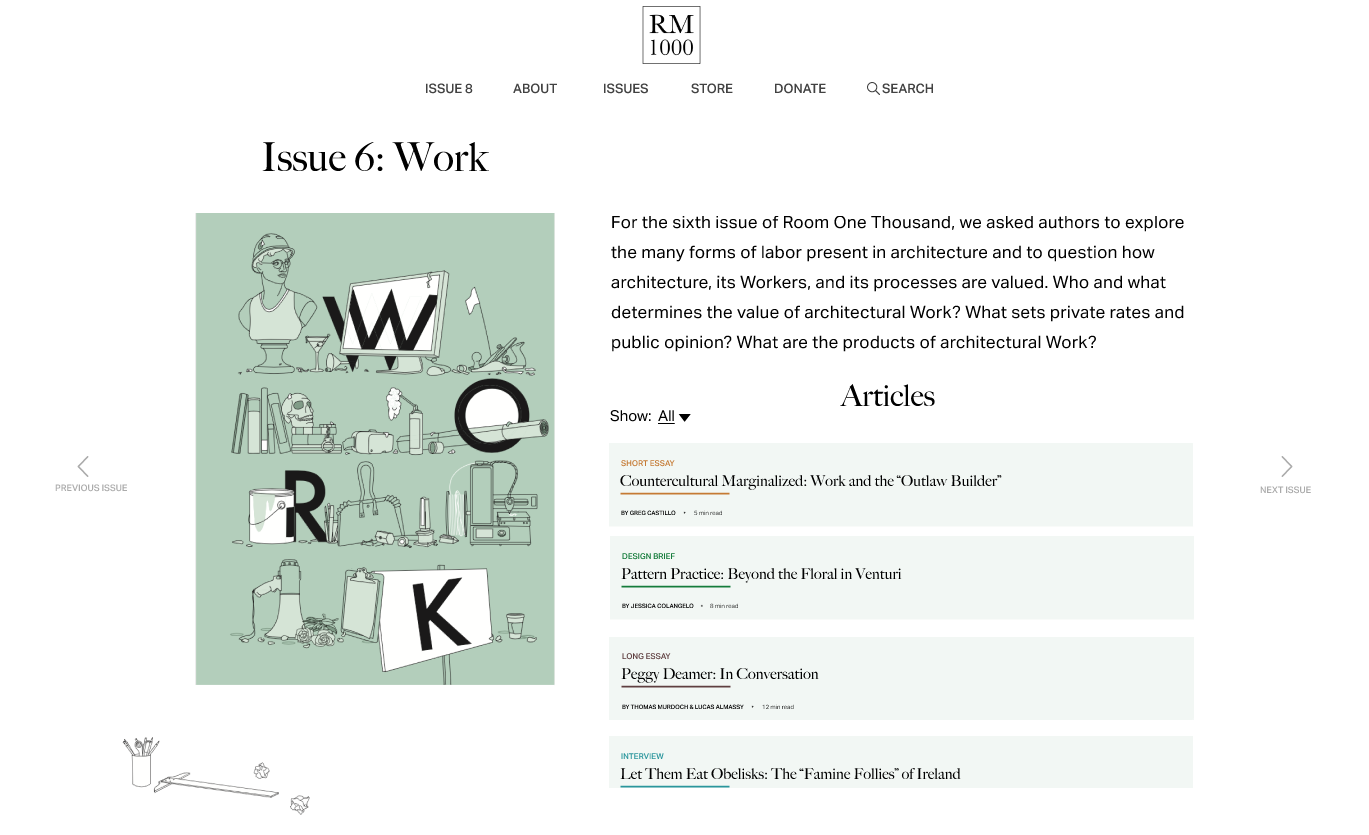
The new “issue 6” page
“Buy” Button
I was struggling with the placement of an actual “buy” button on the page and eventually decided to incorporate it with the cover of the issue. I’m satisfied with the decision because it adds functionality without introducing extra, standalone elements, which risks clustering the page.
Article Browsing
A picture is worth a thousand words—this holds even more true for an architecture magazine. Thus, it became a priority for the article previews to be accompanied by an image.
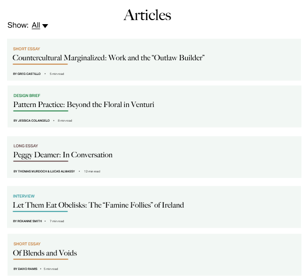
Since there are about 15-20 articles per magazine, it was very important for me to have a clear categorization system to enable filtering for efficient browsing. I decided that the natural way to categorize the articles is by their type: short essay, design brief, long essay, or interview.
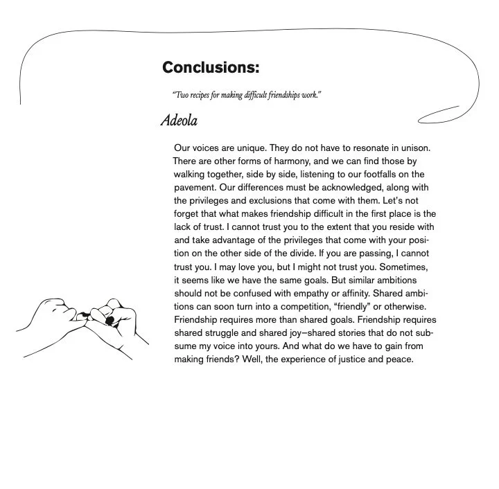
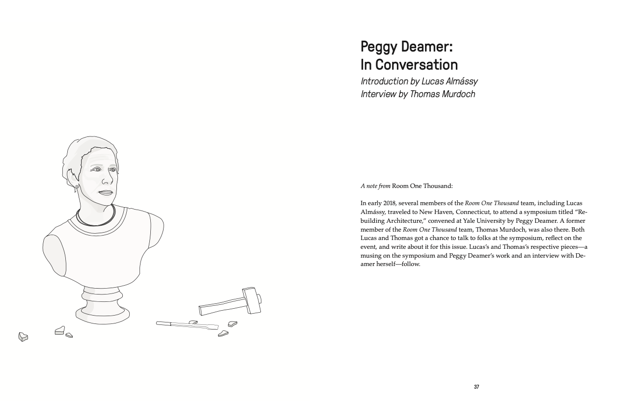
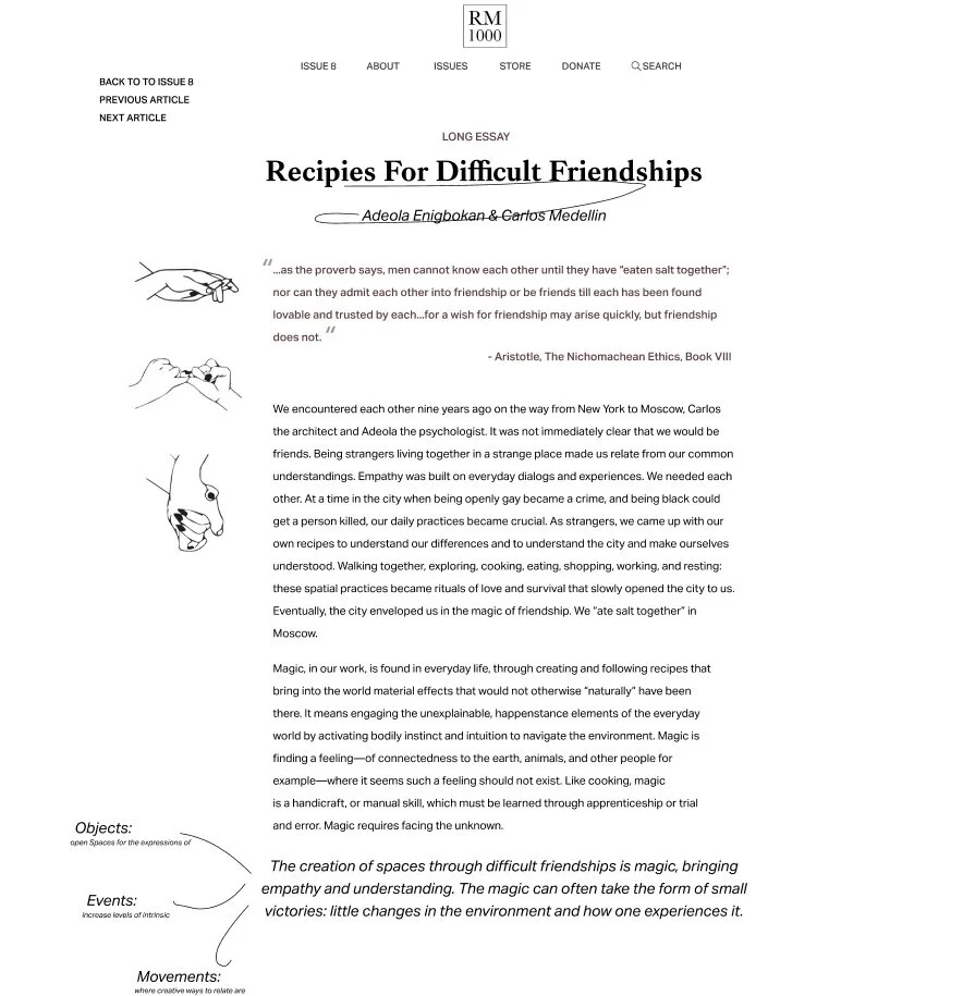
Article Layout
To preserve the style of the original article, I incorporated doodles and hand-drawn elements. The choice of layout, with a narrow text width and clear section headings, makes it easier for long essays like this to keep the readers engaged.
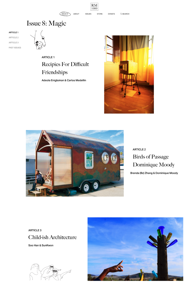
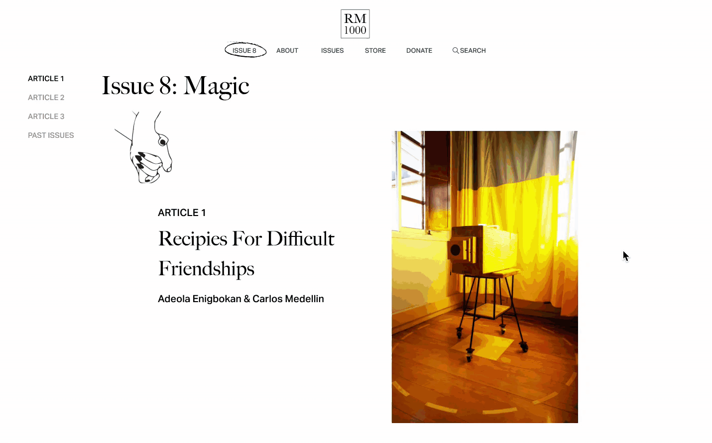
Issue 8
For Issue 8, the new issue they are launching, I wanted to create an immersive browsing experience for three featured articles. To do that, I made sure that only one article is visible to the reader at once in order for them to fully engage with the art piece, to absorb all its colors and ambiance without distraction.
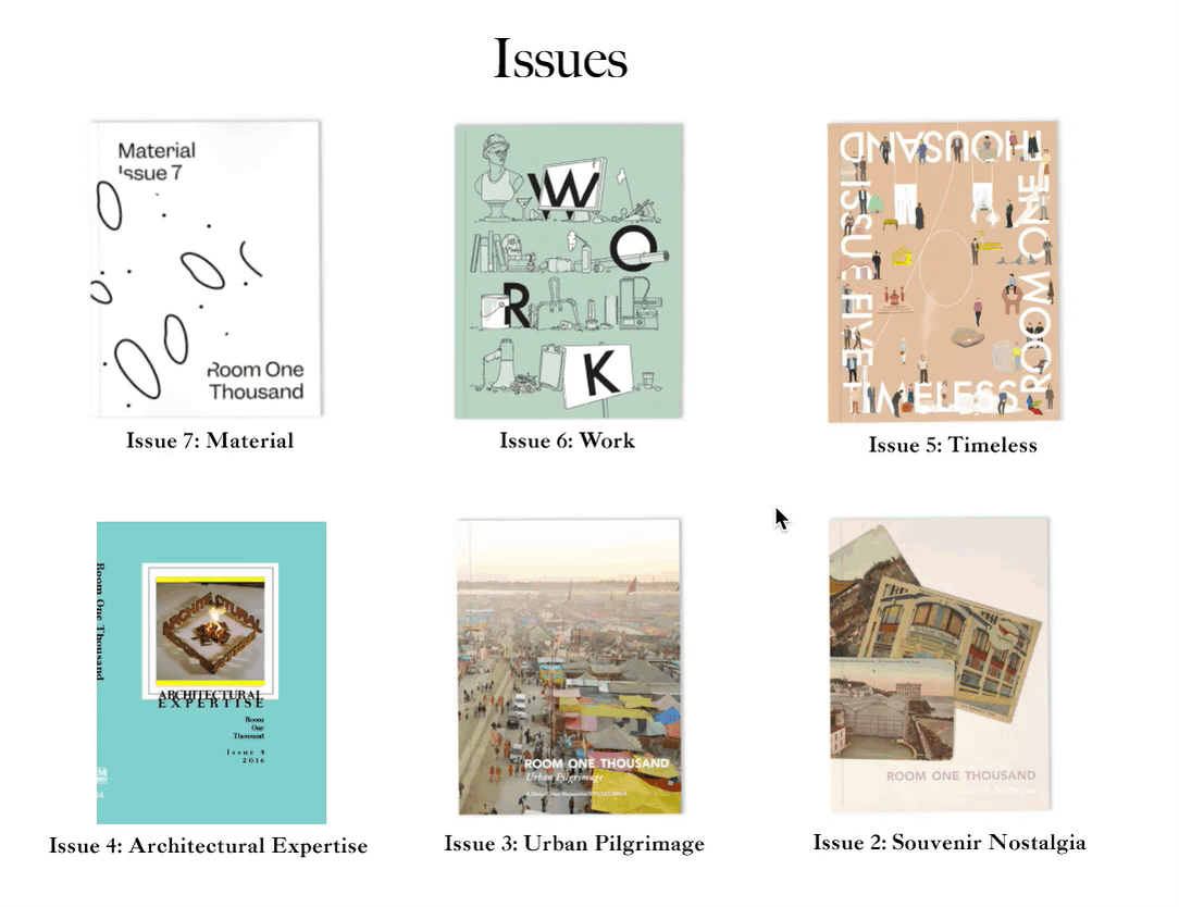
Issues Page
A minimalistic layout with a touch of hovering animation.
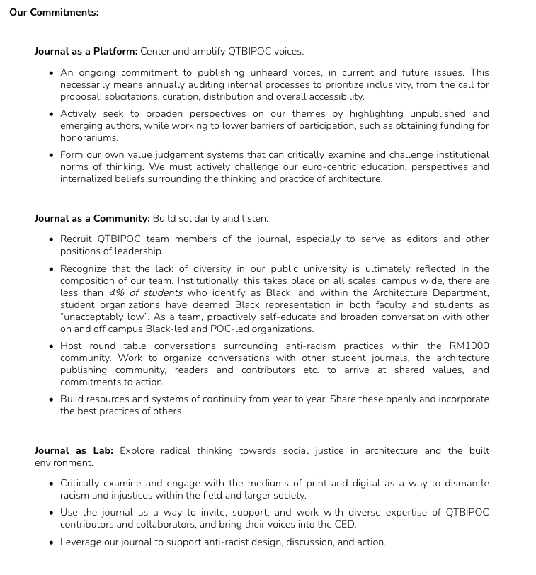
Mission Statement
In my opinion, it’s ok to have a lot of text-based information as long as there is enough visual hierarchy to help readers process the information efficiently. Such visual hierarchy is lacking in the current design.
Current
New
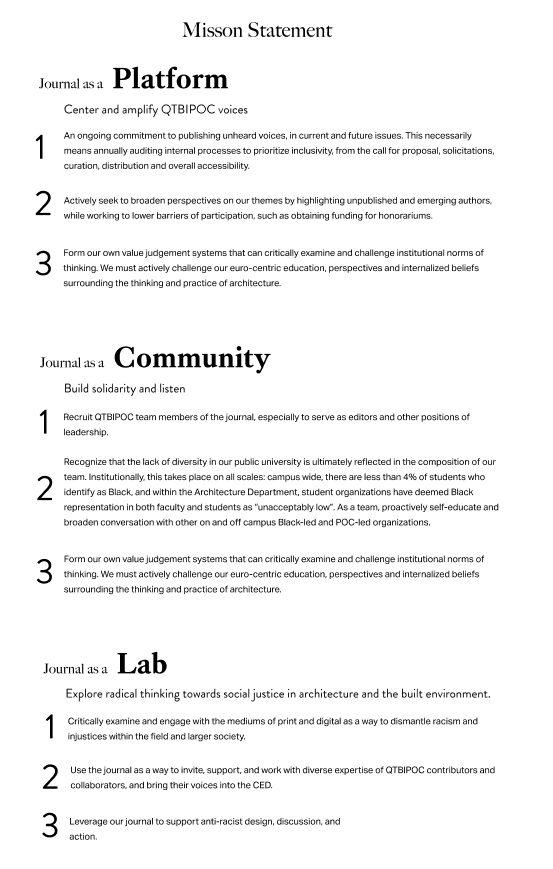
The three keywords I wanted the reader to take away from this section are platform, community, and lab—the three roles the Room1000 serves. My design works to deliver that effect.
Prototype
Reflection
The most challenging thing about this project was trying to be creative and experimental while working under the client’s constraints. For example, the client wanted the issues page to be a grid view with images of uniform sizes, which limited creative freedom. But in retrospect, learning to work under constraints is a valuable lesson in design because that’s usually what goes on in the real world.
Now that the client work is over, I hope to experiment more with the issues page and article layouts to explore the balance between experimental design and usability.