Boarding Pass
Redesign Apple Wallet’s boarding pass for a more intuitive and personalized way to display important boarding information.
Role: Interface Designer
Project Type: UI design, Usability Testing
Team: Individual Case Study
Duration: May 2021 (1 week)
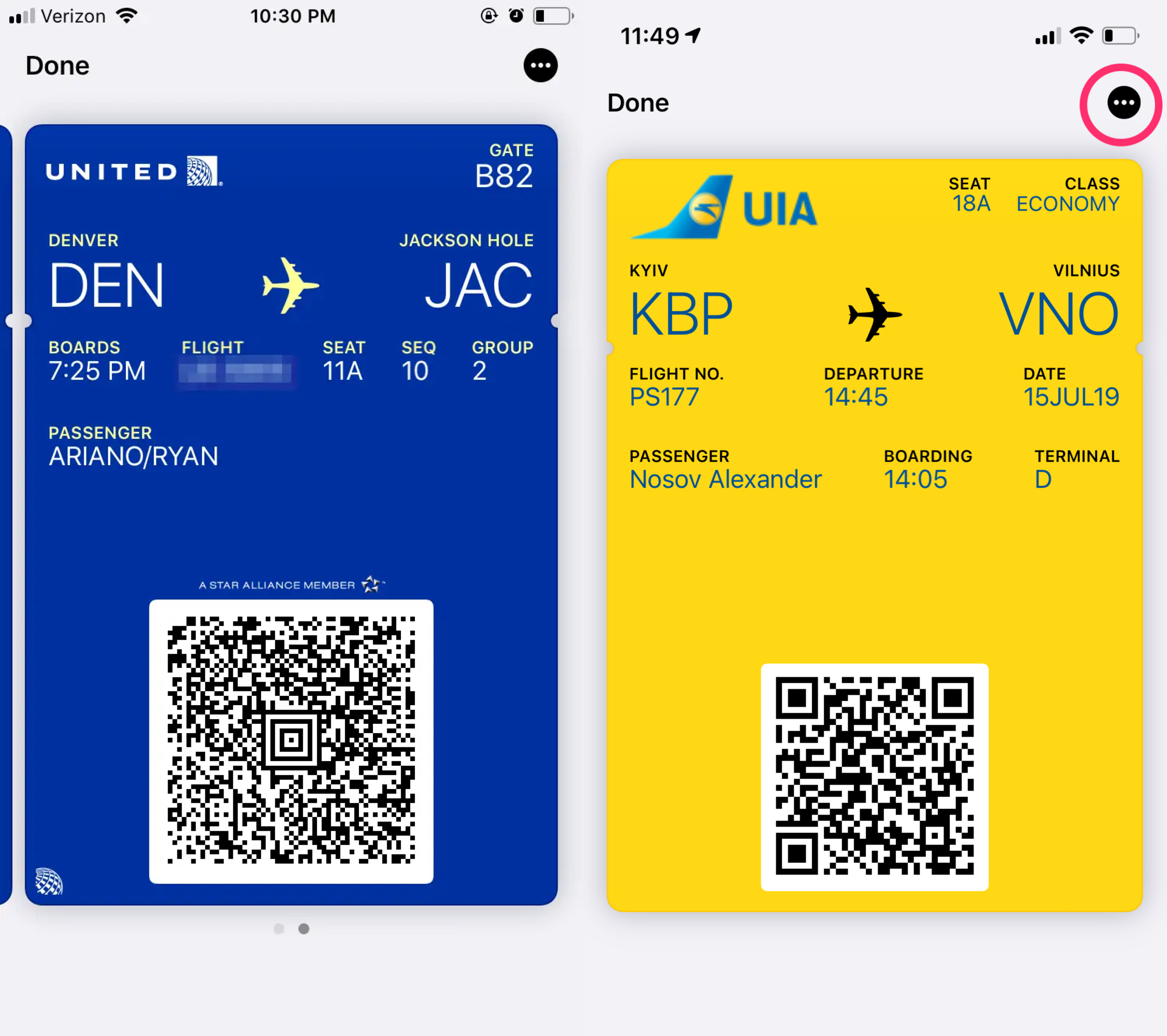
Apple Wallet Passes
Digitalized boarding passes that saves time and resources. While scrambling to dig out my printed boarding pass from my bag at the airport during a family trip over the summer, I noticed (in jealousy) that a lot of people are calmly pulling up their boarding passes on their iPhones and scanning them as they went through security.
After some googling, I found out that you can add your boarding pass to your iPhone’s Apple Wallet, which saves you printing time at check-in and also it’s a win for the environment.
Current Passes
The information displayed on current boarding passes feels cluttered, making it hard to quicky extract important information from the pass. While the current boarding passes provide all the necessary information the passenger will need, it is lacking in usability because of its poor information hierarchy and layout. Important information like flight number, departure time, and passenger name are all cluttered on the top of the pass, leaving unnecessary white space on the bottom of the pass.
Iteration 1
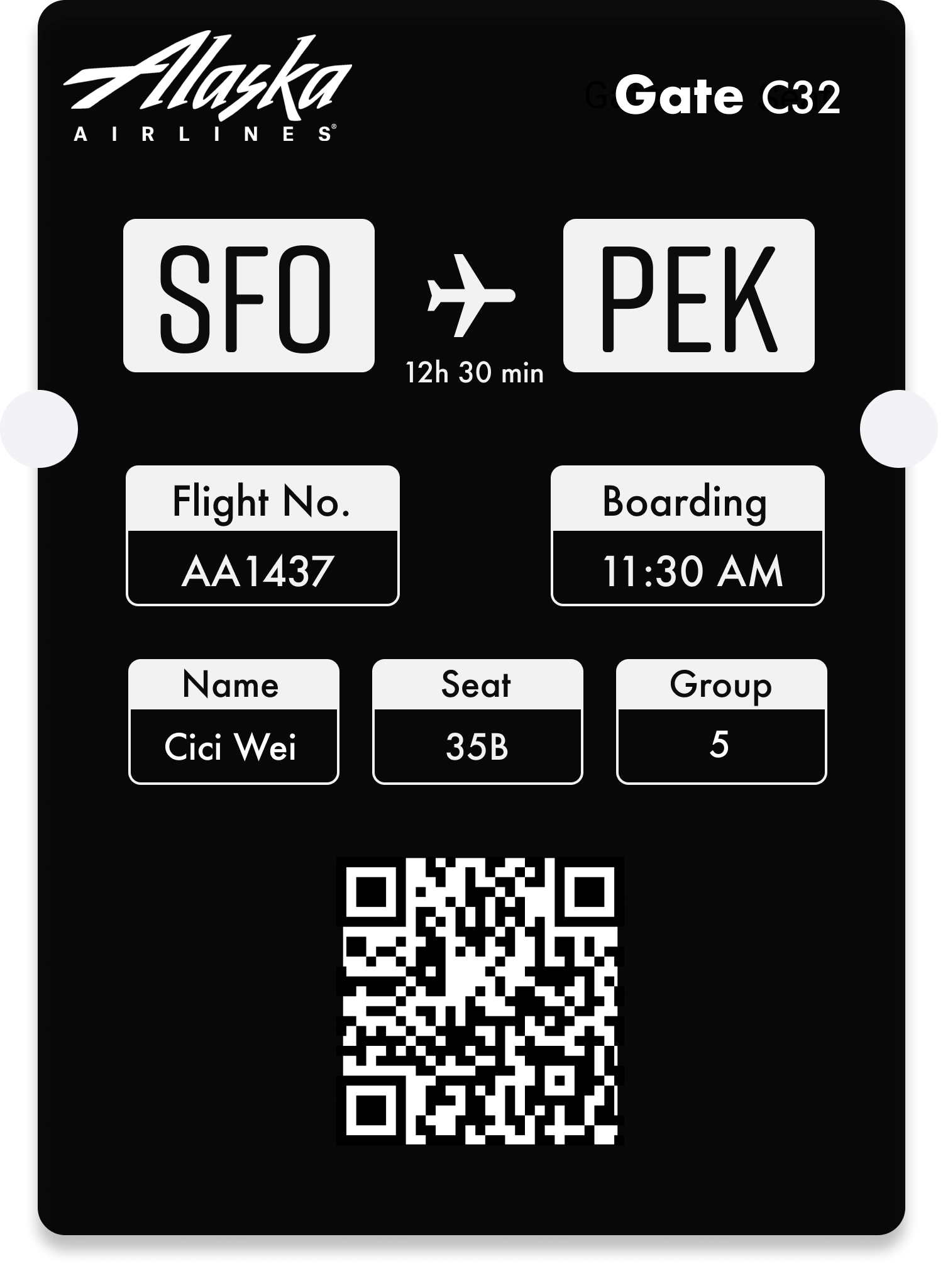
I explored highlighting important information like flight number, boarding time, and seat number by putting them into visually prominent boxes for better scannability.
Usability Issues
Through user testing, I discovered usability issues with my design including the placement of gate number and the size of flight time textI tested this design with 6 participants by asking them to search for information that is present on the boarding pass, paying close attention to their response time. What went right:
box display of information perceived as clear and intuitive
the minimalistic design feels modern
What went wrong:
participants had trouble finding the gate on the boarding pass, which is located in the upper right corner
participants expressed that they wish the flight time is a bit more prominent
Iteration 2
Wait, who’s the real user?
In the previous iteration, I was subconsciously designing for two users: the passenger and the airport staff.
However, I had a moment of revelation while working on the next iteration that all useful information about the passenger the security staff will need is encapsulated in the QR code, meaning that the passenger should be the “real” users of this design. This opens the door to a personalized design for the passenger.
Therefore, in addition to addressing the problems that came up during the usability test, I dived deeper into “designing for the passenger”.
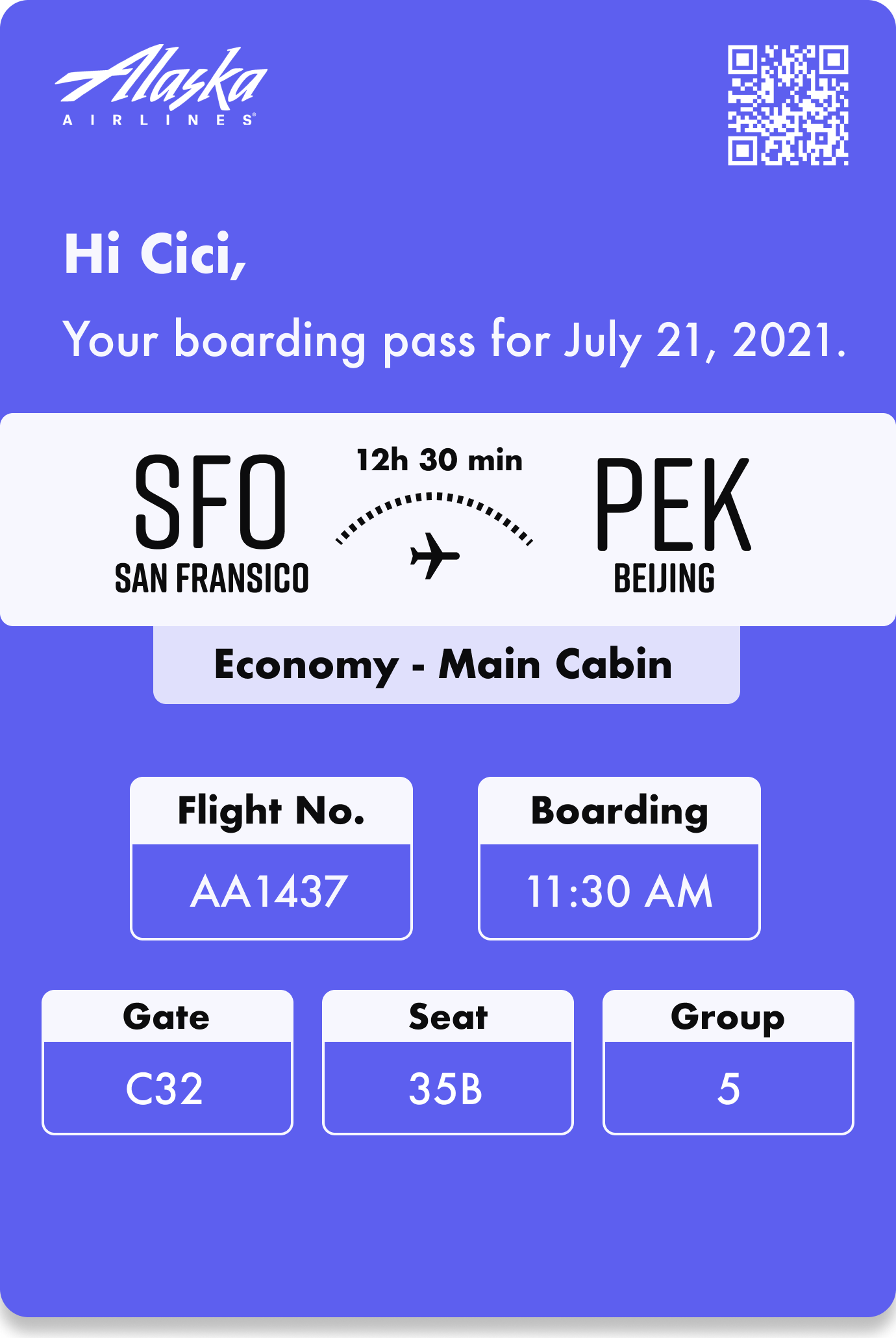
Changes for 2nd iteration
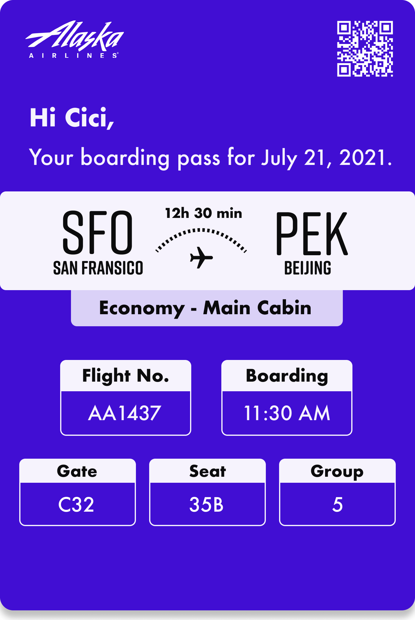
Adding a personalized message at the top of the pass to create a friendly and helpful tone
Significantly de-emphasizing the QR code to reduce irrelevant information for the passenger
Adding the flight class (economy, business, first-class) to remind passengers at boarding
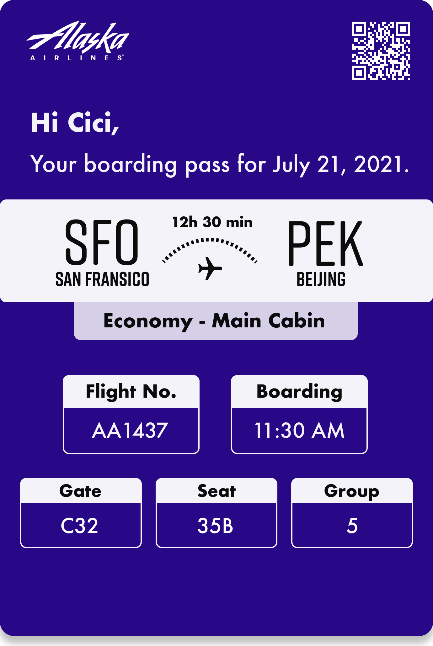
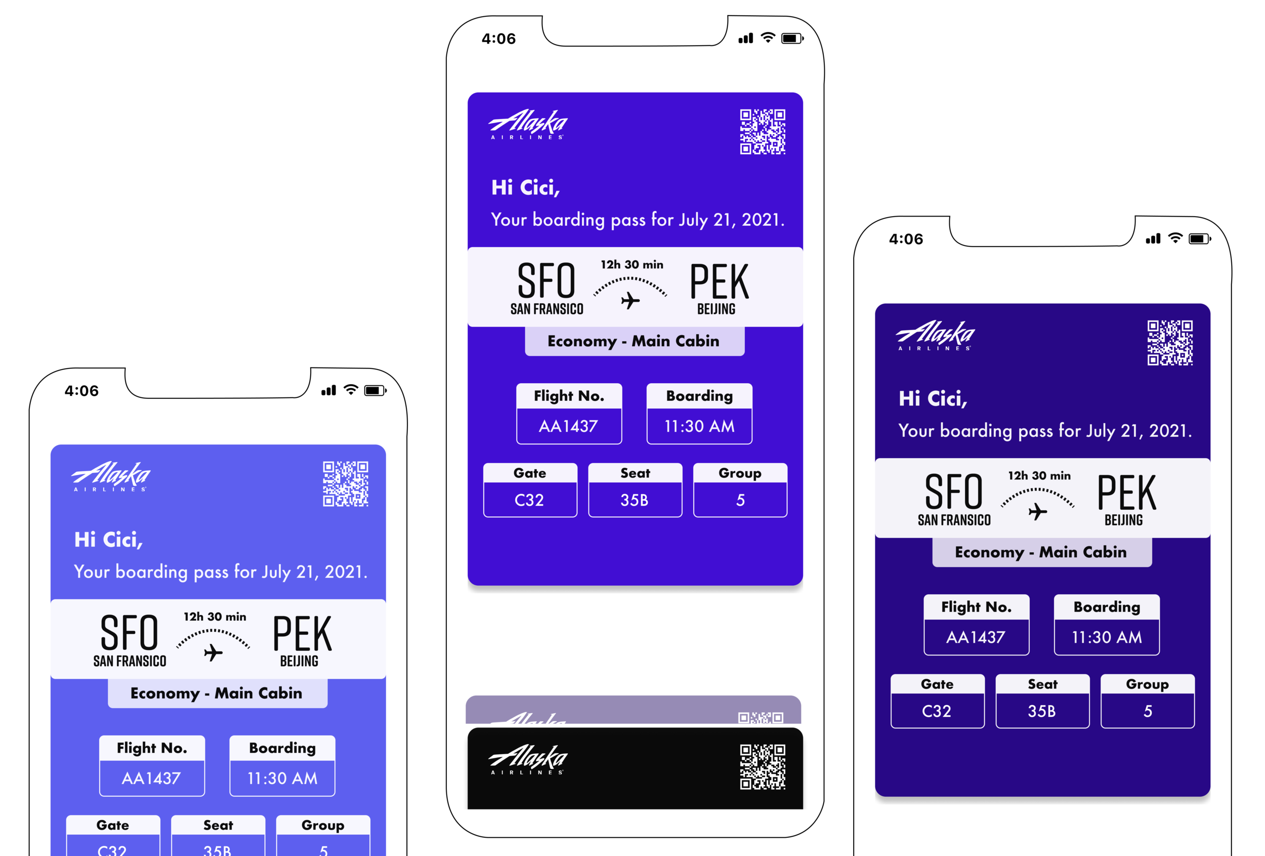
Final Design